Thesis Driven: Transforming a Newsletter into a Premium Digital Publication
Thesis Driven is one of the most influential venture capital and real estate tech publications. We transformed their platform from a basic newsletter into a premium digital magazine with sophisticated content architecture and a world-class reading experience.
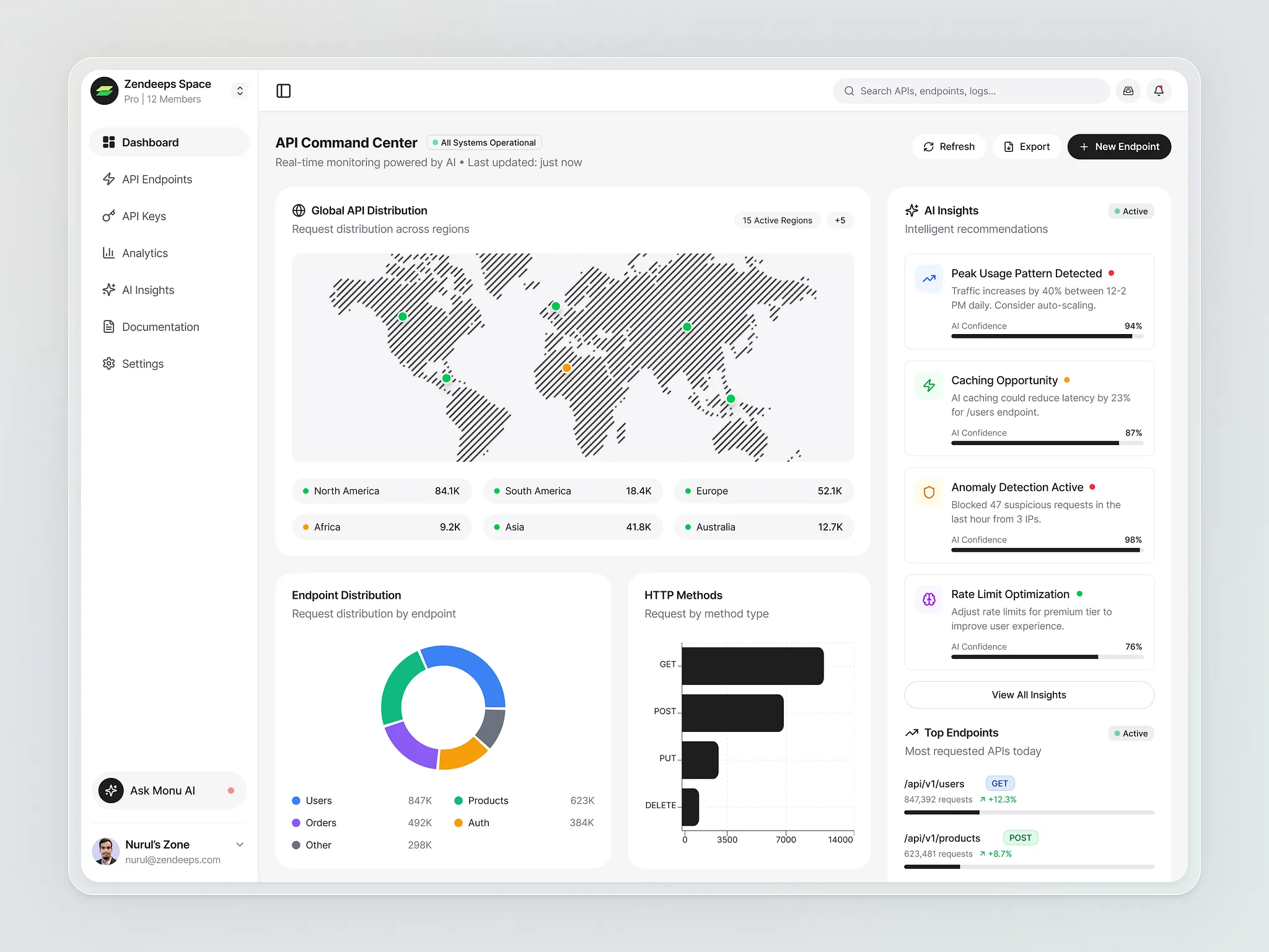
Premium editorial homepage with featured stories and topic-based navigation
Project Overview
Thesis Driven publishes in-depth analysis on venture capital trends, real estate technology, and startup ecosystems. With thousands of subscribers including prominent VCs, founders, and industry analysts, their content needed a platform that matched the quality and authority of their journalism.
When they approached me, they were constrained by a basic Substack setup that limited their growth. The challenge was to create a sophisticated publication platform that felt like The Economist or Harvard Business Review, but with the speed and flexibility of modern web technology.
The Challenge
How do we transform a linear newsletter feed into an engaging editorial platform that showcases premium long-form content, while giving the editorial team full control without requiring technical knowledge?
The Problem Space
Through stakeholder interviews with the editorial team and user research with 50+ regular readers, we identified critical pain points:
Reader Pain Points
- Content Discovery Crisis: Valuable archive content was buried. Readers couldn't easily find articles on specific topics or follow thematic series. The chronological feed made it nearly impossible to explore beyond the latest posts.
- Poor Reading Experience: Long-form analysis (often 3,000+ words) was presented in a format optimized for short blog posts. Narrow columns, inconsistent spacing, and lack of visual hierarchy made deep reading exhausting.
- Generic Brand Identity: The platform looked identical to thousands of other Substack newsletters. For a publication charging premium subscriptions and attracting institutional readers, this was a credibility issue.
- Limited Content Formats: The editorial team wanted to publish interactive charts, data visualizations, and rich multimedia—all impossible or extremely difficult in their current setup.
- No Content Relationships: Related articles, series, and topic clusters couldn't be surfaced. Each article existed in isolation, missing opportunities for deeper engagement.
Editorial Team Pain Points
- Publishing Limitations: Custom layouts required HTML knowledge. Adding footnotes, pull quotes, or sidebars was cumbersome or impossible.
- Poor Analytics: Limited insight into which topics resonated, how readers navigated the site, or where they dropped off.
- Inflexible Design: Couldn't customize the look and feel to match their editorial vision or experiment with layout variations.
Premium article reading experience with optimized typography and rich media support
Research & Discovery Phase
We conducted a 4-week research sprint that included:
📊 Competitive Analysis
Studied 20+ digital publications including Stratechery, The Information, and Axios to understand best practices
👥 Reader Interviews
50+ interviews with subscribers to understand reading habits and content discovery patterns
📝 Content Audit
Analyzed 200+ articles to identify content themes, series, and taxonomy opportunities
🎨 Brand Workshop
Collaborative sessions to define visual identity, tone, and brand positioning
Key Research Insights
- Readers wanted depth, not speed: Unlike news sites, subscribers expected to spend 15-20 minutes per article. The interface needed to support sustained attention, not quick scanning.
- Trust through design: Visual polish directly impacted perceived content quality. Readers unconsciously associated design sophistication with editorial rigor.
- Archive is gold: Subscribers specifically mentioned frustration finding older content. The archive represented massive value that was being wasted.
Our Design Approach
Based on our research, we structured the redesign around three core principles:
1. Content-First Architecture
Every design decision serves the content. We created a sophisticated information architecture with topic-based navigation, series tracking, and smart content recommendations that surface related articles and keep readers engaged.
2. Premium Reading Experience
We designed a custom typography system optimized for long-form reading, with generous line height, optimal line length (65-75 characters), and a type scale that establishes clear hierarchy without overwhelming the reader.
3. Editorial Empowerment
Built a custom Webflow CMS that gives editors unprecedented flexibility. They can create complex layouts, embed interactive elements, and experiment with formats—all without writing code.
Design Solutions & Features
1. Sophisticated Information Architecture
- Topic-Based Navigation: Organized content into 8 core topics (VC Trends, PropTech, Market Analysis, etc.) with visual topic cards and curated collections.
- Series & Collections: Created a system for multi-part series with automatic navigation between installments and series-specific landing pages.
- Smart Search: Implemented Algolia-powered search with filters by topic, author, date, and reading time.
- Related Content Engine: Automatic recommendations based on topic tags and reading patterns keep users engaged across sessions.
2. Premium Typography & Reading Experience
- Custom Type System: Chose Freight Text for body content (elegant serif perfect for long-form) paired with Inter for UI elements and metadata.
- Optimized Line Length: Set content container to 680px wide (approximately 70 characters) for comfortable reading.
- Progressive Disclosure: Implemented expandable sections for long articles, allowing readers to navigate quickly while maintaining context.
- Rich Media Support: Custom components for pull quotes, footnotes, inline charts, and data visualizations that integrate seamlessly into the reading flow.
3. Flexible Webflow CMS
- Layout Flexibility: Created 5 article templates (standard, feature, interview, data story, quick take) each optimized for different content types.
- Rich Content Blocks: Modular components (quote blocks, stat highlights, image grids, embedded charts) that editors can mix and match.
- Metadata Control: Comprehensive tagging system for topics, series, authors, and custom taxonomies.
- Scheduling & Workflow: Built-in publication calendar with draft/review/published states for editorial workflow management.
Intuitive CMS interface enabling editors to create rich layouts without code
4. Visual Identity & Branding
- Refined Color Palette: Sophisticated navy and gold color scheme that conveys authority and premium positioning.
- Photography Style: Established guidelines for hero images—abstract, modern, high-contrast imagery that complements rather than competes with content.
- Iconography System: Created custom icons for topics, actions, and UI elements that feel cohesive and professional.
- Consistent Spacing: Implemented 8px grid system ensuring visual rhythm and polish across all pages.
Technical Implementation
Why Webflow?
We evaluated several platforms (custom CMS, WordPress, Ghost) but chose Webflow for several critical reasons:
- Design Freedom: Pixel-perfect control over layout without fighting WordPress themes or building custom code
- Performance: Built-in CDN, image optimization, and modern hosting infrastructure deliver sub-second page loads
- CMS Flexibility: Highly customizable content types and relationships without complex plugin dependencies
- Editorial Experience: Clean, intuitive editor that non-technical team members can master quickly
- Maintenance: Zero server management, automatic security updates, and 99.99% uptime SLA
Technical Highlights
- Performance Optimization: Lazy loading, WebP images, critical CSS inlining achieving 95+ PageSpeed scores
- SEO Architecture: Structured data, automatic sitemaps, canonical URLs, and social meta tags
- Analytics Integration: Custom Google Analytics setup tracking reading depth, content engagement, and conversion funnels
- Email Integration: Seamless connection with ConvertKit for subscriber management and email campaigns
Impact & Results
The redesigned platform launched in Q2 2025 with significant measurable impact:
Qualitative Feedback
"The redesign elevated our entire brand. We went from looking like a newsletter to feeling like The Economist. Reader feedback has been overwhelmingly positive, and we've seen a measurable impact on engagement and subscriptions."
— Editorial Director, Thesis Driven
Lessons Learned
- Platform matters: The right CMS choice dramatically impacts both reader experience and editorial productivity. Webflow's flexibility was essential to our success.
- Archive is an asset: Don't let old content die. Proper information architecture transforms archives from graveyards into discovery engines.
- Typography is UX: For content-focused sites, typography decisions have more impact than flashy interactions. Getting line length, spacing, and type scale right is foundational.
- Editorial input is crucial: The best publishing platforms are co-created with editors. Regular feedback loops during development prevented costly late-stage revisions.
- Performance affects perception: Fast load times weren't just technical wins—readers associated speed with professionalism and quality.
Building a premium content platform?
Let's create a digital experience that matches the quality of your content and keeps readers coming back.